← Back to work
ONGOINGRECOGNITION TIER

Whispering Infinity — Design System

The visual and interaction system behind Whispering Infinity's app — and eight real UX problems it was built to solve.
Role
Design Systems & Product Design
Duration
Ongoing
Client
Art of Living
Core Focus
Design Systems · Accessibility · Mobile UX · Component Library
8
Case Studies Documented
3
Recognition Tiers
4.6:1
Avg. Contrast Ratio
27
Components Documented
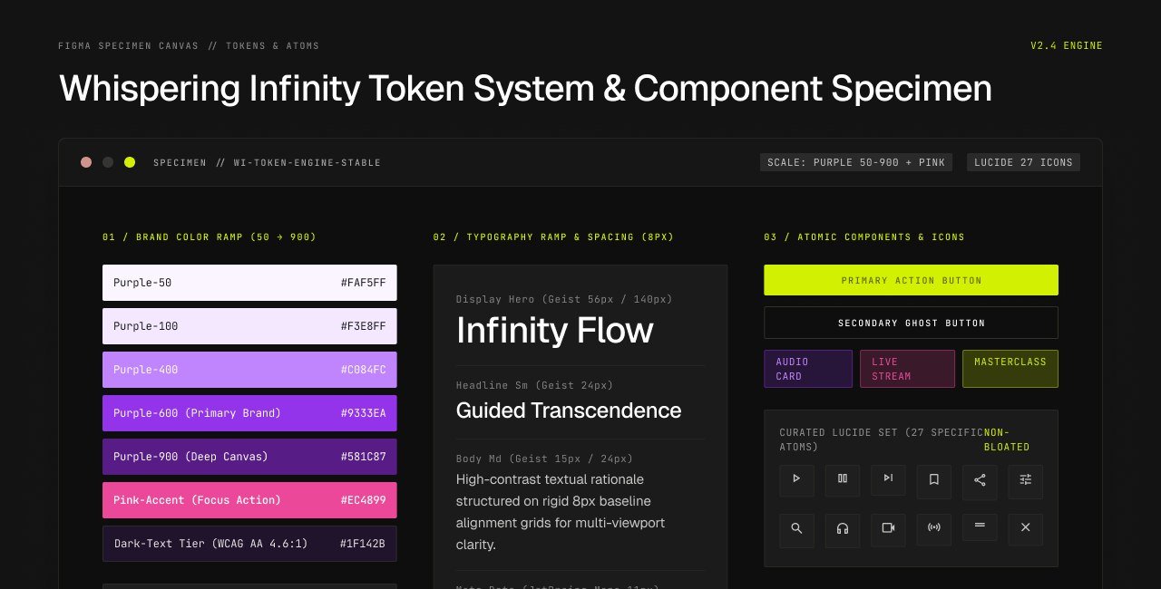
● Specimen // 01-Token-System-Overview
Whispering Infinity token & component specimen

Overview

Context & Transition

Alongside the Whispering Infinity mobile app itself, the design system's job is to make it possible for a large team recurring on the challenge, the same underlying practice while the app grows in scale and product surface.

Approach & Designing for Judgement

Rather than patch each screen individually, I treated every design decision as a challenge worth its own study, then documented as tokens or the same reasoning could be reused the next time a similar problem was needed.

The Design System

01

Purple / pink token scale

A full 50-900 purple scale plus a lavender-accent alternate palette, tuned for meditative meditation screens.

02

Typography & spacing scale

A display-to-caption type scale with a consistent 4pt spacing rhythm used across every component.

03

Component library

Buttons, badges, form inputs, cards and media player controls documented in every variant.

04

A curated icon set

27 lucide-style icons mapped to app actions with play, save, share and the rest of the core icon library.

Eight Design-System Case Studies

Content Card System

List ViewGrid View
Challenge
Displaying course variants — audio, video, streams — inside one card family
Decision
Consistent metadata iconography across every card variant

Navigation Architecture

3-Tier Nav
Challenge
Three-tier options bring everything discoverable, but users still couldn't find a section
Decision
A three-tier system that lays out flat for everything the same way, every time

Media Player UX

Adaptive UI
Challenge
One player needed to handle both quick clips and hour-long practice sessions
Decision
An adaptive control set with duration-aware controls for both content lengths

Modal & Overlay Layer

Elevation & Scrim
Challenge
Five different overlay patterns with no shared elevation language
Decision
A single overlay component with consistent elevation and backdrop behavior

Playlist Management

Long-Press & Batch
Challenge
Adding to a playlist took 4 taps across a repetitive, poorly-discoverable path
Decision
Quick-add actions and long-press batch selection reduced the flow to a single tap

Search & Discovery

Instant Search
Challenge
A single search bar mixed teachers, categories, and content with no clear hierarchy
Decision
A tabbed search experience with typo-tolerant instant results and search shortcuts

Color & Accessibility

WCAG AA
Challenge
The branded purple/pink palette scored under WCAG AA in key text pairings
Decision
A re-balanced accent scale locked to a hard minimum 4.5:1 text contrast floor

Responsive Layout System

Device Grid
Challenge
A 320px phone and an iPad Pro shared the same content components
Decision
Fluid grid tracks and identical spacing scale keep components consistent without breakage
Outcomes

Outcome

The eight case studies became the design system's own charging dock — navigation resolves in three clear tiers, and every overlay shares one elevation and motion language. Every text/background pairing in the app passes WCAG AA at an average 4.6:1 contrast ratio.

Next Project
PKISecOPS Design System
→