PKISecOPS Design System
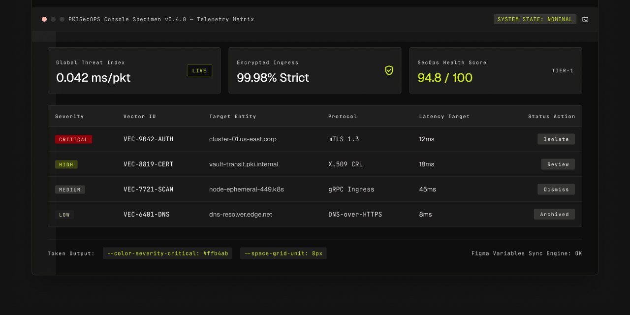
A twelve-section design system — from grid and tokens to governance — built for a security operations platform where analysts scan dense data under pressure.
Executive Rationale
The Challenge
A security operations dashboard lives or dies on dense, fast-scanning data — tables, charts, real-time alerts, severity badges — and every one of those tables needed to be accessible, consistent and fast for analysts working under pressure, across a growing team of contributors.
The Approach
Rather than starting from components, I started from tokens — color, spacing, typography, radius, shadow and motion — then built the component library, layout system and chart guidelines on top of that shared foundation, and closed the loop with a governance model so the system stays coherent as new contributors add to it.
Eight Pillars of the System
Foundations
The base layer: a 12-column grid, 8px spacing scale, color and typography tokens that everything else builds on.
Design Tokens
Every foundational value — color, spacing, typography, radius, shadow and motion — expressed as a token and consumed everywhere in CSS, JSON and Figma variables.
Component Library
Buttons, inputs, tables, cards and empty states, every component documented in default, hover, focus, disabled and error states.
Layout System
A standard grid-shell — collapsible sidebar, header content and a defined breakpoint system from 768px tablets up to 1440px+ ops displays.
Data Visualization
A dedicated chart color palette, sharp bar chart types with fine severity coding, and gridlines and axis conventions for security dashboards.
Interactions & Motion
A duration and easing scale, keyboard-navigable interaction states for every input, and explicit focus, active, hover and disabled interaction patterns for every keyboard action.
Accessibility
WCAG 2.1 AA contrast ratios, keyboard navigation patterns for every dashboard component, and manual and automated AA reference checks on every screen.
Governance
A six-stage contribution workflow, from defined intent and approval matrix to production release, so design and engineering share one source of truth.
Outcome
The result is a fully documented system spanning foundations through governance: a 12-column grid and 8px spacing scale, 10+ core components in every state, WCAG 2.1 AA-compliant color and keyboard patterns, a dedicated data-visualization palette for security dashboards, and a six-stage contribution workflow with its own approval matrix — so design and engineering share one source of truth instead of reverse-engineering each other's work.