MyBUD
An independent UX teardown of a mood-aware wellness app — tracing how five quick questions turn into one personalized recommendation, screen by screen.
Overview
The Approach
I walked the file screen by screen — onboarding through home, summarizing content and session copy, mapping the information architecture, sampling the actual color system via the ten palette explorations rather than estimating, and cross-referencing the ten palette explorations against what the team ultimately shipped.
The 9-Step Pre-Home Intake Funnel
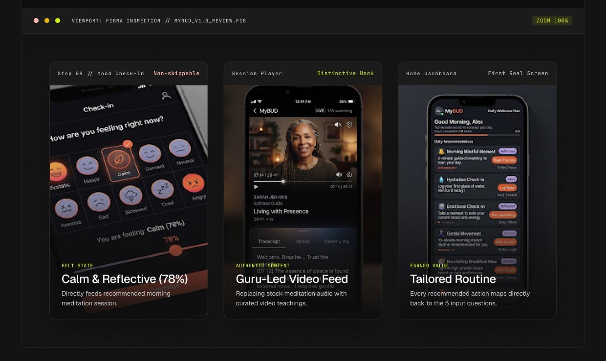
Before a user ever reaches the home screen, MyBUD asks for a language, a mood, a time budget and a felt emotion — a nine-step funnel that walks drop-off risk, and the one step every other app in this file skips (the mood check) is defensible.
What's Working (4 Key Strengths)
A restrained, purposeful palette
One primary action color (orange) and one reflection accent (lavender) span 10 variations before landing on this pair — warm says ‘do something’, cool says ‘pause and reflect’.
Personalization feels earned, not creepy
Every question the app asks — mood, time, location, ability — so users can trace the ‘why’ behind each suggestion.
No dark patterns in the exit paths
Skip, ‘May be later’, and a plain ‘Go back to Home’ appear consistently — the flow never traps a guilt-trips the user.
A distinctive content hook
On-camera guru-style teaching content differentiates the recommendation output from generic stock meditation audio.
Opportunities — What I'd Fix Next
Proof-read before build
Two typos (‘faced’, ‘economized’) exist in the current production Figma file at high-visibility screens — quick copy polishing before publishing.
Give the tab bar an active state
All five tabs sit at a constant weight with no visual cue for which screen is selected — quick tab-state addition.
Shorten the pre-Home funnel
Nine steps before a user ever defers the 9-step quiz cost session, since they already skip if it feels too long.
Reconsider the no-skip mood check
Mood check-in is the required, non-negotiable step, a lightweight tap-first option would fit the app without weakening it.
Resolve the store-listing name
The Play Store mock-up reads ‘Self Care – Sleep, Meditation’, which doesn't map to the app's real MyBUD branding — worth confirming before real store listing.
Tidy duplicate layers
Two nearly identical layers were named identically in the recommendation and personalization file, both used a warning, since finding the right one requires guesswork.
“The intake funnel is the product — the sequence of five short questions makes the first real screen feel already personalized.”
Design Review Takeaway — Independent UX TeardownOutcome
The intake funnel is the real product here — five short questions powered by anonymized RAG-style tagging make every real screen feel already personalized, even a small type, one missing word, and a possibly-outdated store name.