SCOPE Plus
Untangling two merged enterprise tools into one usable platform through an 8-point heuristic evaluation.
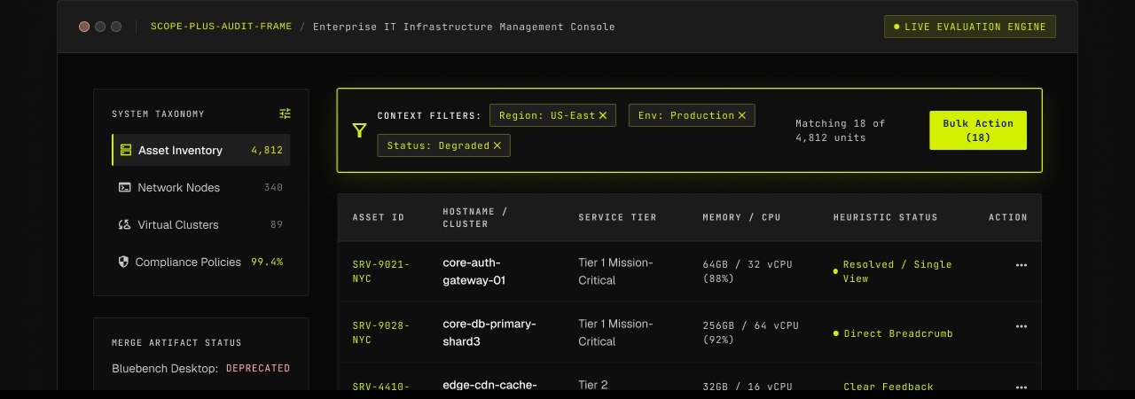
The Friction of Two Legacy Monoliths Forced Together.
Hidden Features & Label Schisms
Crucial operational actions were buried three levels deep inside nested menus, forcing technicians into high-friction workflows. Identical database queries were titled ‘Export’ on one screen and ‘Extract Data Dump’ on another, breaking mental models and creating operator distrust.
Triple Search Systems & Excess White Space
Three distinct search bars competed for attention on a single screen — global, server-side and asset-specific — while default desktops wasted expansive slices of white space, requiring excessive scrolling to cross-reference basic asset records.
8 Usability Evaluation Verticals
Navigation & Wayfinding
5-Point Flagged
Query & Filter Mechanics
5-Point Flagged
Control & Status Feedback
4-Point Flagged
Input & Progressive Staging
4-Point Flagged
Error Prevention & Rescue
3-Point Flagged
Content & Jargon Hygiene
3-Point Flagged
Personalized Latency & Render
2-Point Flagged
Feature Parity Alignment
1-Point Flagged
What the Audit Found — and Fixed
A menu that hid the destination behind the door
Import, Export, Reporting, and Administration were grouped into nested multi-level dropdowns, forcing users to click through wrapped breadcrumb anchors and predictive caching.
The breadcrumb followed the title instead of leading it
Inverted visual hierarchy across sub-page navigation — cross-app dropdowns used inconsistent labeling when nested inside multi-route trace maps.
Icons that looked the same but meant different things
Abstract glyphs were used without text labels, and different icons wrapped identical actions internally, obscuring straightforward feature relationships.
Three different systems, all pretending to be search
Global search, page-level query and List View filters operated in total isolation, giving conflicting counts for the exact same query.
Actions that happened silently
Uploading server assets showed no receiving migration confirmation; deployed configuration changes were queued in a generated diff, but weren't guaranteed to be applied.
Long, undifferentiated forms with no map
Asset onboarding required filling one long, single-page form with no strict field grouping and zero pre-fill capability from historical records.
From scattered subjective friction to an 11-day engineering roadmap.
The heuristic review turned scattered subjective friction of eight distinct components into a structured, actionable roadmap — each backed by a specific recommendation and engineering cost, that mapping the outcome into a structured, approximately 11-day plan, with only the List View remaining in architectural rebuild.